Unless you have been in hiding for the past forty years, you will know that even in countries that are rich in aggregate, poverty is really bad for wellbeing – bad for physical health, bad for mental health, and bad for satisfaction with life in general. Definitions of poverty for developed nations generally include some notion of relativeness: it’s about having less than most people in your society. Under this definition, you can’t ever entirely make poverty go away, since numerical equality of income and wealth is unlikely (though, of course, you can make the gaps smaller, and this seems generally to be a good idea, for all kinds of reasons including those discussed below). So it is worth asking: are there places where the wellbeing burden of relatively low income is smaller, and places where it is bigger? And what do those places do differently?
I have been having a look at this using the data from the European Quality of Life Survey (2012). (This is a digression from a larger ongoing project with Tom Dickins investigating the consequences of inequality using that dataset, see pre-registration here. There are more details of the sample and measures in that document). I first plotted life satisfaction against income (measured in multiples of the median for the country) by country.
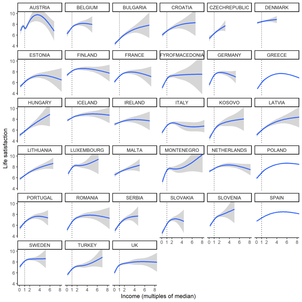
Overall, people on relatively low incomes are less satisfied with life than whose with incomes above the median. Beyond that, the life satisfaction dividend of income quickly tends to saturate. However, the figure seems to show lots of fascinating heterogeneity in the shape of the relationship. Some of this captures real things, like the compressed income distribution of Denmark, and the very dispersed one of the UK. Much of the variation in shape above the median, though, is probably pretty spurious: there are very small numbers of respondents with incomes above about 4 times the median, so those trends are not very precisely estimated (and just don’t ask about Austria). And half of all the people (by the definition of the median) are crammed into the little area between 0 and 1 on the horizontal analysis, so it’s a misleading scale.
What if we split respondents into those whose incomes are above and below the country median? By comparing the mean life satisfactions of those two groups for each country we can get a sense of the psychological cost of being relatively poor.
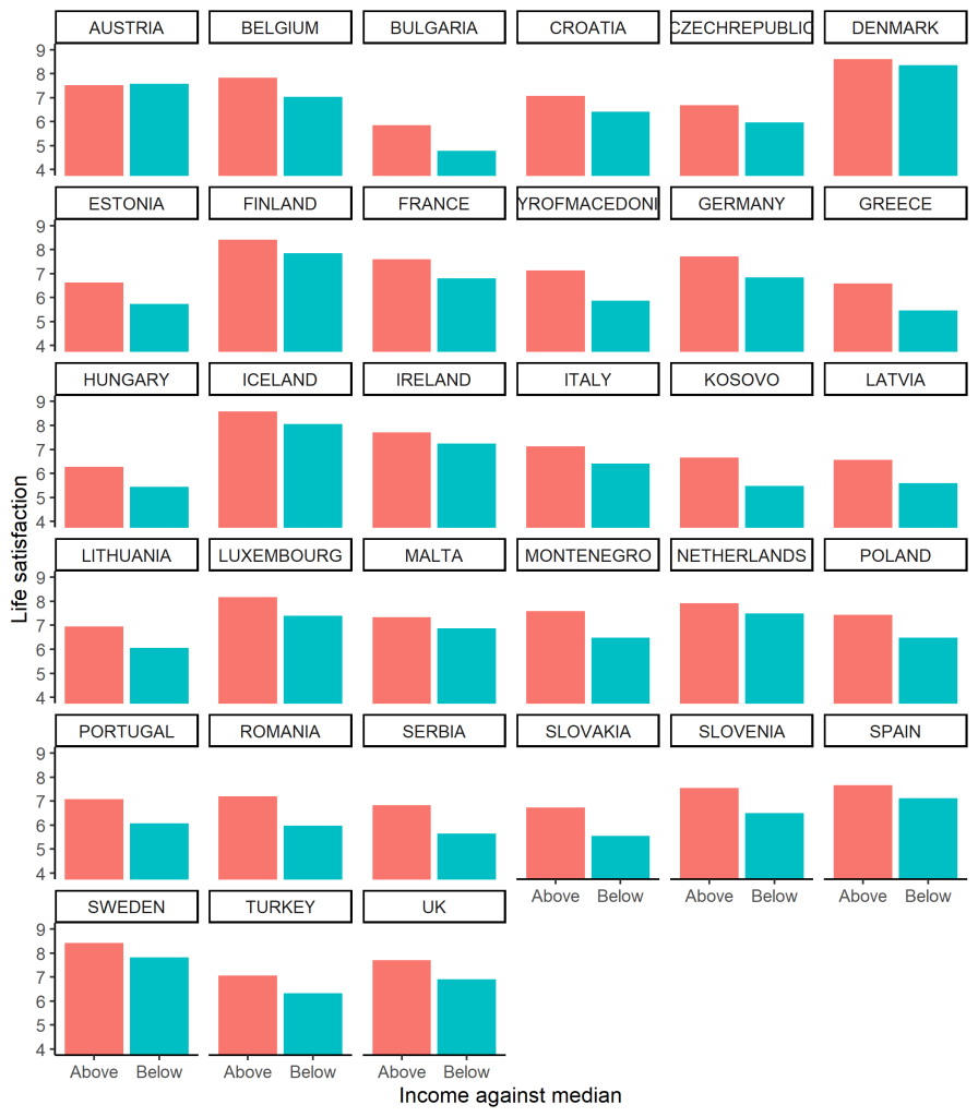
This seems more satisfying: those on low incomes are everywhere (except Austria) less satisfied than those on high incomes, but the magnitude of the gap is quite variable: compare, say, Denmark to Poland. So, the question becomes: what accounts for cross-country variation in the size of this gap? (There are other questions too, such as what accounts for cross-country differences in the overall mean, but here I consider only the rich-poor gap).
A couple of candidate factors leap to mind. First, there is the inequality of the income distribution itself. Where the gaps are bigger, being at the bottom of the distribution might be worse than where the gaps are smaller. This could be true for several reasons: for a start, where the income distribution is more dispersed, many of those below the median are a long way below it in absolute terms, with all the material problems that is going to cause. Or maybe, as Kate Pickett and Richard Wilkinson have tireslessly argued, where the gaps are bigger, people notice them more, and this puts them into a psychologically more unpleasant mode: stressed, competitive, and paranoid about social position. This would affect the poor more strongly. So one candidate for explaining the size of the rich-poor life satisfaction gap is the inequality of the income distribution of the country, which we measure with something called the Gini coefficient.
Another possibility is that being relatively poor is more tolerable in countries with good access to public services for everyone, especially healthcare. In the health inequalities literature, this is often referred to as the neomaterialist hypothesis (for example in this paper here). This is somewhat confusing, since it is not appreciably more materialist than all of the other possible hypotheses, nor obviously more neo, nor quite as Marxist as it sounds. Anyway, we have measures of this in the dataset: ratings of problems accessing healthcare, and ratings of problems accessing other services such as culture, public transportation and other amenities. I calculated the mean ratings of problems of access to these things just for the people whose incomes were below the country median. I then plotted the size of the rich-poor life satisfaction gap against our three potential explanatory variables: the Gini coefficient, problems accessing healthcare, and problems accessing other services. (Note, on the plot below, the gap is expressed so that positive 0.5 means the poorer half of the population have life satisfaction that is 0.5 scale points lower than the richer half. And yes, the one outlier with a negative gap – the poor are happier – is Austria).
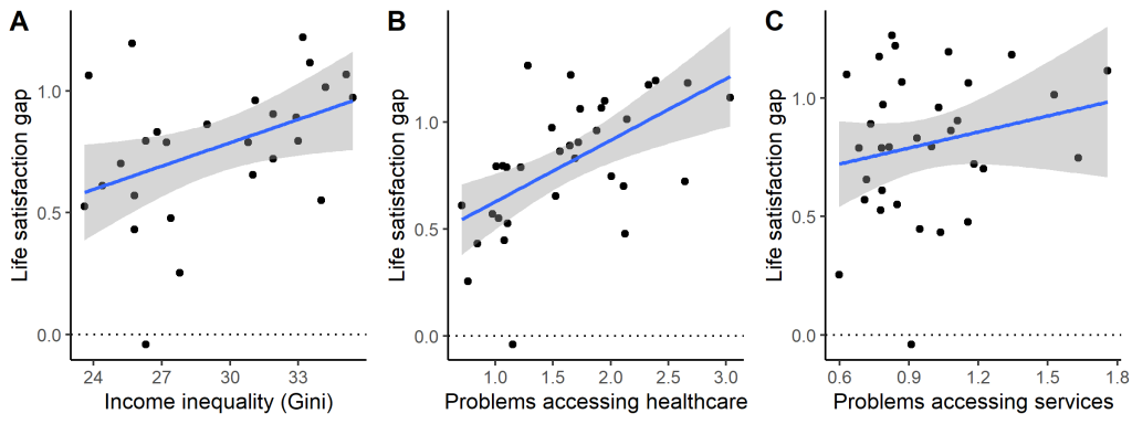
On the face of it, there seem to be positive associations between all three predictors and the size of the life satisfaction gap. However, causal inference is tricky, not least because, unsurprisingly, all three predictors are also somewhat correlated with one another: in more unequal countries, it’s also more difficult for people with low incomes to access healthcare. I ran a model selection algorithm. The best fitting model simply contains problems accessing healthcare (and problems accessing healthcare also has the strongest bivariate correlation with the size of the life satisfaction gap, 0.5). In other words, if people on low incomes can easily access healthcare, the burden of their low income for their satisfaction with life is substantially mitigated. For every standard deviation reduction in problems accessing healthcare, the life satisfaction gap between rich and poor shrinks by half a standard deviation.
However, a second model with both problems accessing healthcare and the Gini coefficient as predictors comes out almost equally likely to be the best model to explain the data. In other words: the data are nearly as compatible with an explanation where both the dispersion of the income distribution and the problems the relatively poor have accessing healthcare contribute to the life satisfaction gap. Even in this model, though, problems accessing healthcare is the variable with the larger beta coefficient.
This is not yet a proper analysis of these data – this is only a taster, and no firm conclusions can yet be drawn. However, it does look like this particular dataset (and outcome measure) points one way rather than another in ongoing debates about how to level up health and wellbeing: should we be prioritising making cash transfers (i.e. increasing low incomes), or providing universal (free) basic services, thus alleviating some of the problems lack of money leads to ? This is a complex argument on which I have usually been on the cash transfer side. Doubtless both are required. However, this dataset does seem to point to the importance of excellent and accessible services for making modern life tolerable at all rungs of the income distribution.
To subscribe to this blog via email, enter your address in the Subscribe box on the right.